2023 | OKX
Fiat to Crypto
The growing popularity of cryptocurrencies has prompted interest in activities involving these digital assets, emphasizing the significance of fiat- to-crypto conversion for broadening access to crypto assets.
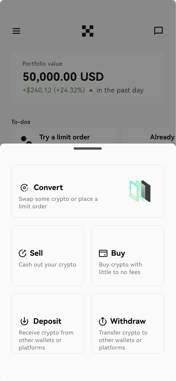
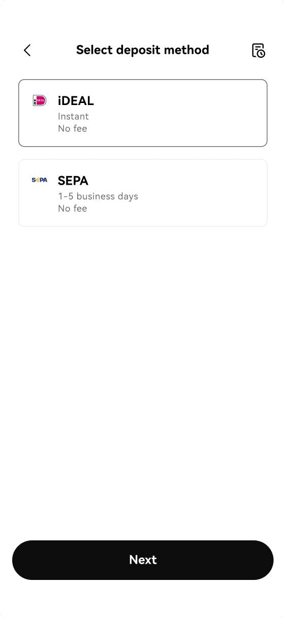
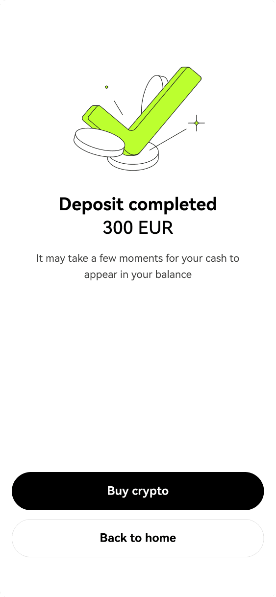
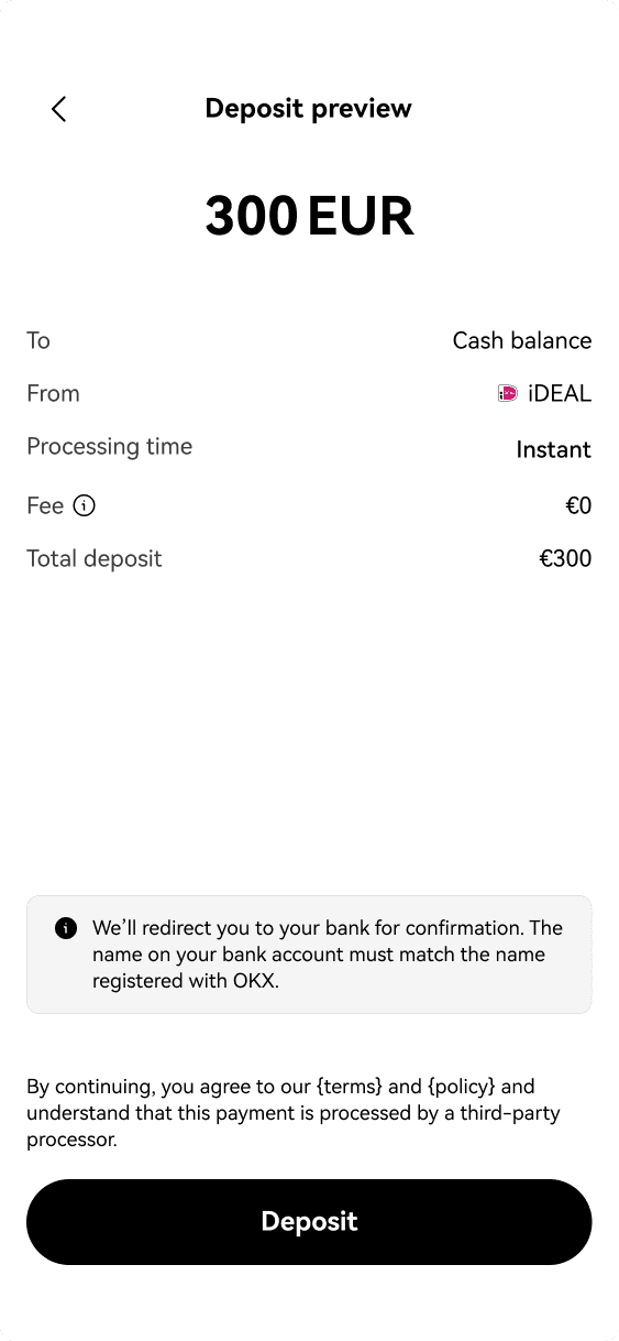
The Fiat to Crypto initiative - conceived during the merger of cryptocurrency exchanges Okcoin and OKX (resulting entity) - serves as a primary interface for individuals entering the cryptocurrency domain. Focused on four essential functionalities—buy, sell, deposit, and withdrawal—it aimed to streamline and democratize crypto-asset transactions. I was the lead designer for the deposit experience.
The main challenge was developing a global template that could adapt to local experiences, accomodating specificities in currency and payment methods.


Team
05 Product Designers [US, Brazil]
01 Product Designer, Design System [US]
02 Content Designers [US]
05 Product Managers [China, US]
10 Engineers [China, US]
My role
Lead Designer for the Deposit experience
Results
$**,***,325
Value deposited
56,1%
Conversion Rate
97,4%
Success Rate
People use fiat to buy crypto
Fiat-to-crypto exchanges operate like traditional brokerage platforms, yet their distinctive attributes set them apart in the world of cryptocurrency. Instead of navigating through intermediaries, users can acquire crypto directly from these exchange platforms. Okcoin is one of them, and as OKX gears up for its merger with Okcoin, it becomes ever more compelling for OKX to adopt these features.
In the PRD written by Product Managers, the problem was stated as "Create a scalable solution for fiat payments experiences at OKX leveraging off of what was done in Okcoin". I've rewrote this statement to include pain points from businesses and users:
Create a scalable solution for fiat experiences on OKX that
Complies with multiple new countries
Allows users to migrate from Okcoin to OKX smoothly
Sets OKX as a real competitor in the market, containing all the main features big players do, such as smal fees, and multiple fiat currencies and payment methods,
The project faced several initial internal challenges:
Lack of Fiat Payment Services on OKX
This issue, involving Engineering and Design teams, highlighted the absence of traditional fiat payment options on the OKX platform. Addressing this would require a collaborative effort to integrate such services while maintaining the platform's integrity and user experience.Centralizing User Journeys
A major task for the Engineering and Design teams was to create and implement a modularized template. This template needed to be versatile enough to accommodate local requirements, ensuring a cohesive and user-friendly experience across different regions.Profile Verification through IP or Country
Handled by the Compliance team, this challenge involved verifying user profiles based on their IP address or country. This process would activate once a user selects a currency, determining the available payment channels based on their legal entity. Such a system required careful planning to ensure compliance with various regional laws and regulations.
Collaborating with designers & cross-functional peers
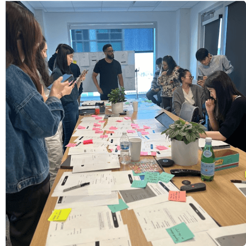
Together, the Product Designers worked on the project’s baseline by evaluating Okcoin’s fiat deposit and OKX’s crypto deposit experiences.
We also identified reusable elements and limitations, gathering insights from a competitor analysis. One example was identifying each country’s patterns in displaying bank account info. Certain pages were designated to share the same design, allowing for contextual adaptation (e.g., result screens).
Review sessions involving Design, Product, and Engineering were conducted to achieve consensus on the Minimum Viable Product. At the Deposit experience, this meant allowing only push deposit transactions.
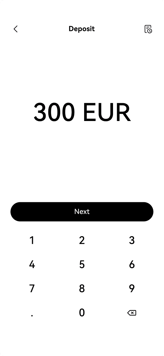
A debate arose regarding the incorporation of a screen for users to input deposit’s amount. While Product Managers advocated for it, I argued that the flow should exclude it when transactions are finalized within the banking app, as opposed to OKX’s app. This is because there would be no data verification between the entered amount on the screen and the actual deposited amount.
QA & ROI
Once designs were finalized, my focus shifted to quality assurance across mobile (iOS, Android) and web platforms, besides framing Return on Investment for the overall fiat experience on the Crypto for All project. Some of my suggestions were:
UX Metrics
Frequency of return (Engagement)
Average number of sessions per user (Engagement)
Returning users (Retention)
Repeat purchases (Retention)
Completion rate (Task Effectiveness & Efficiency)
Help tickets & support contact (Task Effectiveness & Efficiency)
Average time on task (Task Effectiveness & Efficiency)
Framing ROI# of purchases x buy fee = new revenue
# of purchases x sell fee = new revenue
Success rate x withdraw fee = new revenue
CS ticket reduction x cost/ ticket = costs savings
The Brazilian Experience
Upon completing the deposit template, the next step was applying it to specific countries experiences. As a native, I got to lead Deposit and Withdrawal experience for Brazil. The team identified the need to incorporate Pix - a widely adopted Brazilian instant payment system - as a payment method.
Pix enables transfers through pix keys or QR codes, eliminating the requirement for beneficiary details. The discussion around its incorporation involved:
Product Management Proposal
Display QR code and pix key, to provide users flexibility in managing their transfers.Global Management Proposal
Display QR codes, avoiding ID mismatch scenarios, reducing the likelihood of refunds and associated fees.My Proposal
Only display pix key. Some of the arguments presented - and that persuated stakeholders - were:• Scope expansion: once QR code expires after 30-minute, designing its update scenario would increase the team’s workload.
• Fee for unmatched ID: research proved it to be minimal.
• Device: using the same device for OKX’s app and QR code scanning may pose challenges for users.
Using Figma's Variables to scale
To enhance the scalability of this project, I conducted an in-depth study of Variables, a feature recently introduced in Figma. Over a period of two weeks, I successfully integrated Variables to achieve the following objectives:
Automated Content Adaptation
This enabled swapping content to cater to various currencies and countries, ensuring a localized experience.
Responsive Web Design Optimization
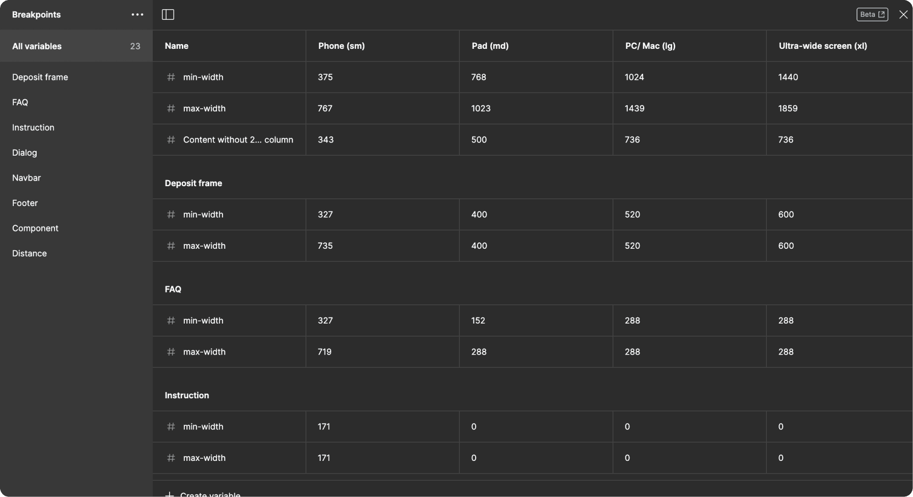
This facilitated adapting design to four distinct breakpoints, from mobile phones to large desktop screens.
Areas for improvement
1. Enhance Interaction Design
Crafting more delightful and intuitive interactions to enhance user experience and engagement.
2. Research-Driven Guidance Adaptation
Despite timeline constraints, propose integrating swift, targeted research to discern when to extend further guidance. This approach could have aligned time with insightful testing to refine the user experience.
Takeaways
1. Cultural and Communication Understanding Adopting a keen sensitivity to diverse communication styles and cultural nuances fosters a more inclusive and productive team environment.
2. Robust Data-Driven Decision Framework Supporting my suggestion with concise and compelling data insights boosted decision-making efficacy.


