2024 | Crypto Exchange
Accessibility Audit
As a global company preparing to launch its product in the US, [name hidden due to legal concerns] crypto exchange must comply with ADA regulations. Given that the app is already in a series of countries, the primary challenge was understanding the necessary updates to ensure compliance and avoid potential legal issues. This required a thorough analysis of the existing app to identify areas that did not meet ADA standards and devise strategies for the required modifications.
The mais objective is to mitigate non-compliance risk while maintaining the app's operational integrity and user experience. I got to lead this project with a Content Designer peer.
The team
01 Product Designer [me, Brazil]
01 Content Designer [US]
02 General Counsels [US]
Results
**1
App infractions
**0
Web infractions
**8
Design System infractions [App + Web]
What's ADA?
The Americans with Disabilities Act (ADA) is a comprehensive civil rights law enacted in 1990 in the United States that ensures people with disabilities have the same rights and opportunities as everyone else. It prohibits discrimination against individuals with disabilities in all areas of public life and all public and private places open to the general public.
Compliance with the ADA is essential for companies for reasons like:
Legal Requirement
Non-compliance can lead to legal consequences, including lawsuits and penalties. ADA is enforced by various federal agencies and through private lawsuits. There is no formal regulation in the US, but it is recommended to adopt WCAG 2.1 and 2.2.Improved User Experience for All
Many accessibility features beneficial to people with disabilities, such as straightforward navigation and legible text, can also enhance the user experience for all users.
Perks & Challenges
Level of Effort
Initally the task was to audit iOS and Android versions of our app in both light and dark modes, as well as the web interface, and the DS for each device. Having a design peer with a solid background in accessibility made it possible to check not just text scale, color contrast and touch target, but also infractions such as ARIA labels, landmarks, screen readers, and more.Collaboration
Having the support of a engineer with background in accessibility and enthusiastic product designers from the design systems team was key. His expertise and support helped understand ADA compliance's technical and design aspects.Communication
Understanding how to present findings to stakeholders was a critical step, particularly emphasizing biggest risks and how to ensure products comply with WCAG 2.0 and 2.2.Timeline
The three-week timeline to audit multiple items required a structured approach to identify and document compliance issues, which was very challenging.
Findings
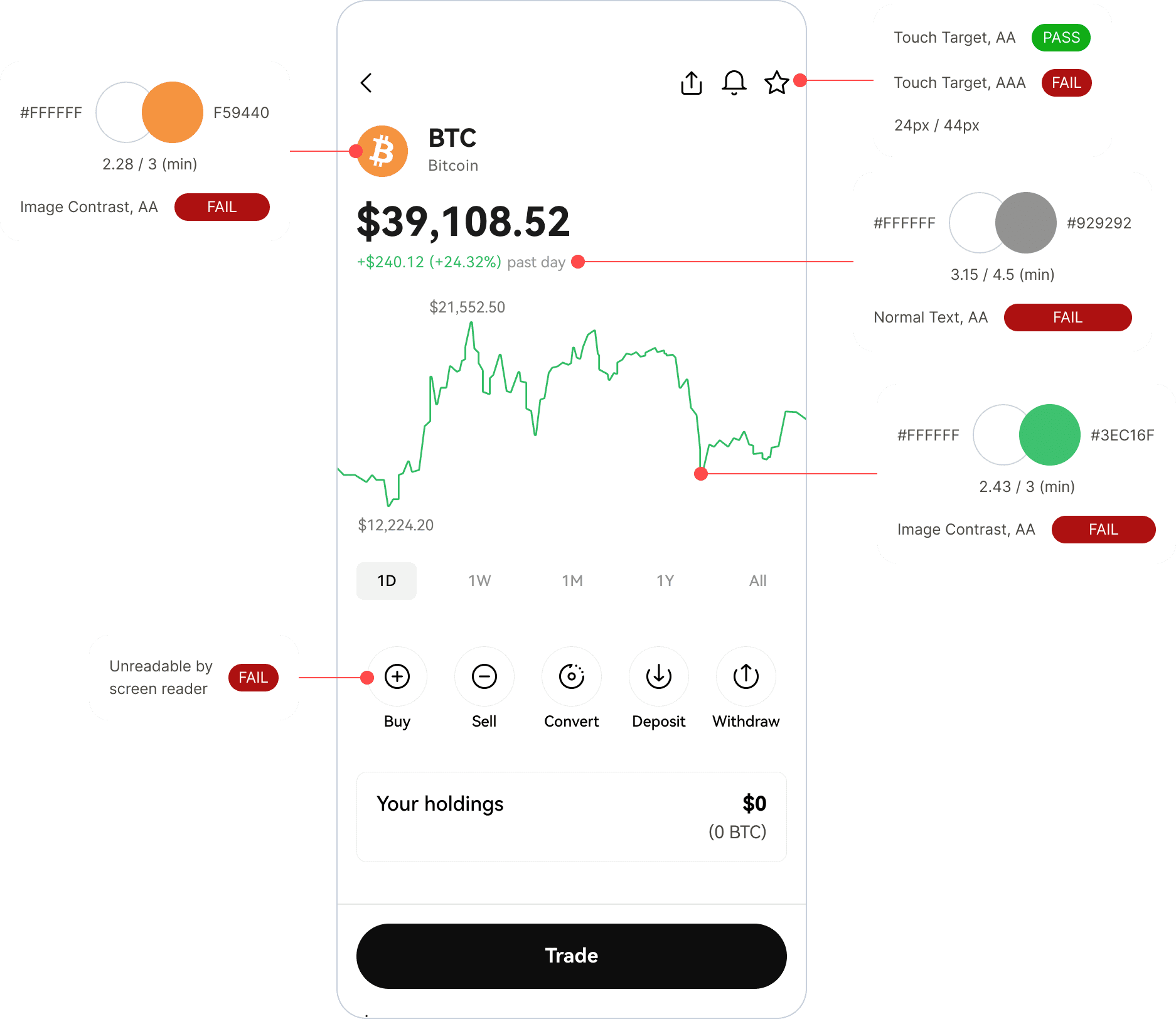
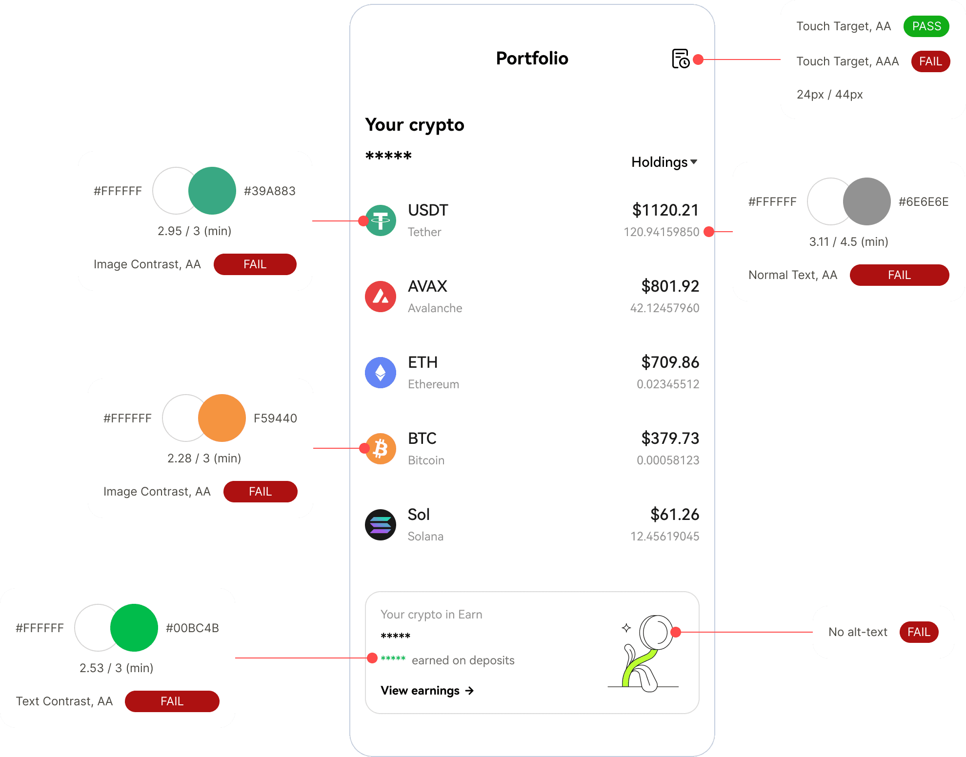
The audit revealed several areas of concern, such as:
Screen Reader Accessibility
The mobile app lacked consistently readable labels for screen readers. Where labels were present, many needed to be more helpful, consisting of random numbers that did not represent the content.Color Contrast and Combinations
Relying on the color specifications in the Design System (DS) proved to be inadequate. In practice, the product exhibited numerous color combinations that needed to be accounted for in the DS, potentially leading to insufficient contrast and readability issues.Design and Implementation Gaps
There was a considerable inconsistency between design specifications in Figma files and their actual implementation in the product. This highlighted the communication gap between DS and engineering teams.
Complete case study available upon request
